Main menu
You are here
landmarks, static roles, alerts and feedback, add keyboard access, application and presentation roles, live updating information and more
Objectives and Activities
- Identify WAI-ARIA landmarks
- Describe common static roles
- Create accessible alerts and feedback
- Use WAI-ARIA to add keyboard access
- Identify when and where to use WAI-ARIA application and presentation roles
- Use live regions for live updating information
WAI-ARIA Landmarks
WAI-ARIA landmarks are used to define regions on a web page, providing a means for assistive technology users to effectively navigate among the various areas of the page. They should be used with other means of within-page navigation, such as bypass links and page headings. These two latter means have been around for much longer and many will continue to use these elements as their primary method of moving around within a web page.
There are eight landmark roles. Follow the links below to read about each type of landmark.
In the following short video (1:07) you will see how ChromeVox interacts with landmarked regions for the next activity coming up in this unit. Use it as a model for implementing your own landmarks, and aim to have your activity submission operate the same as it does in the video.
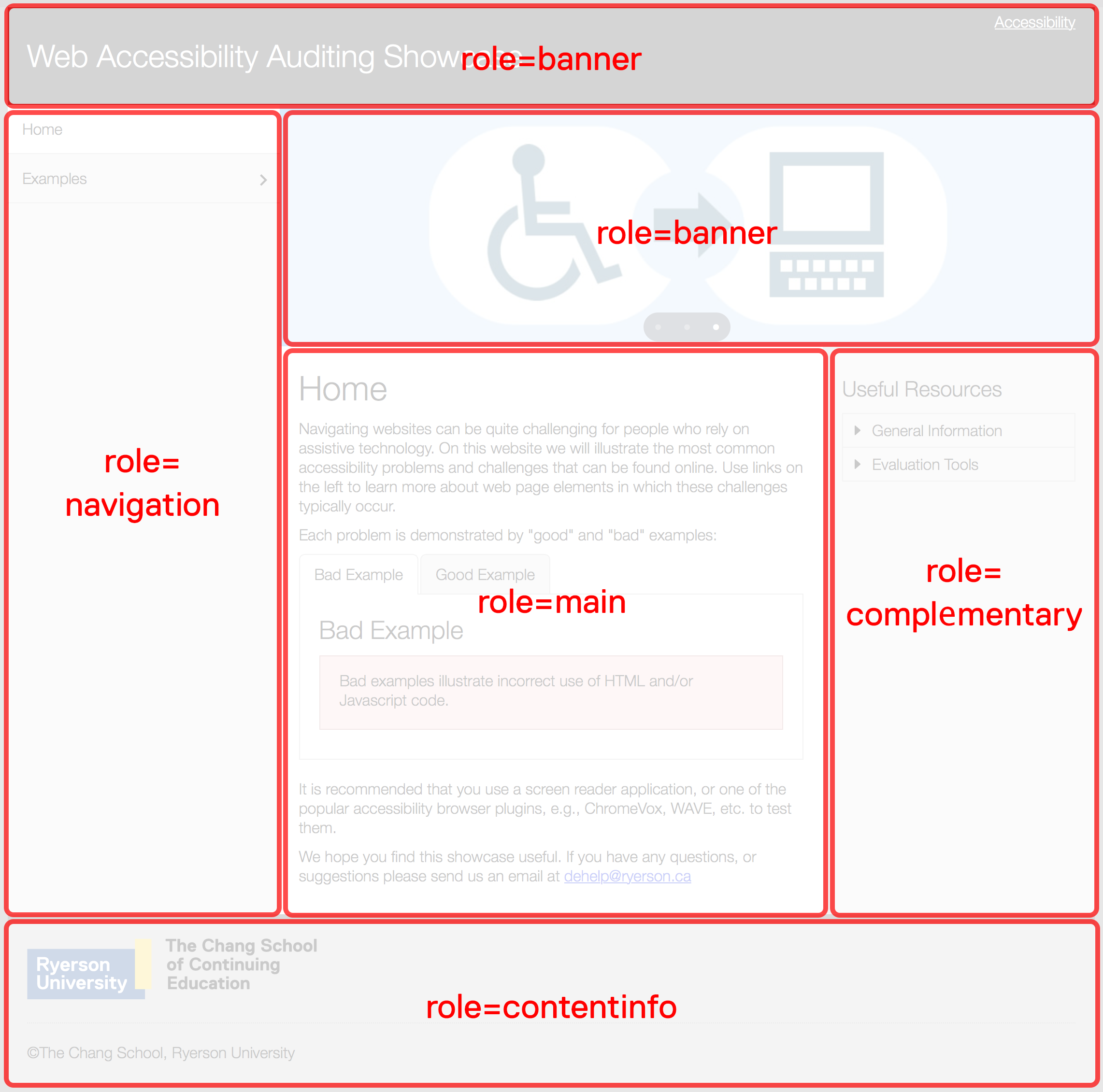
To help visualize landmarked regions, the figure below presents well-defined areas on the page, each of which serves a different purpose. Banner areas, the element that contains the content of each banner region, would be assigned role=”banner”. The menu on the left would have its container assigned role=”navigation” , as would other navigation bars or menus if they were present. The main content area, assigned role=”main”, is where the primary content of the page appears. There should only be one main region. The region on the right containing secondary information, assigned role=”complementary”, is where you might find advertising or related resources. And finally, the container around the footer area would be assigned role=”contentinfo”. This is where details such as copyright, a privacy statement, contact information, etc., would be located.
This particular layout is just an example. Websites may be laid out in a multitude of ways. The landmarks assigned to any given region should reflect the function of that particular region, regardless of where it might appear on the page. If advertising were spread across a region at the bottom of the page, for example, then that region would be assigned role=”complementary”.
Example of landmarked regions of a web page
Custom Regions
While most of the landmarks are relatively self-explanatory in terms of what they should contain, role=”region” needs some explanation. This landmark role can be used to contain specific information that is not effectively described by one of the other landmark roles and is important enough that a user might want to navigate directly to that area of the page. When it is used, it must be accompanied by aria-label or aria-labelledby if there is an existing element on the page that describes the region (such as a heading).
For example, you may want to define a specific area on each page where contact information or a contact form is located. The following markup might be used to define a “contact region.”
Other Considerations when Using Landmarks
The whole page defined in regions: When landmarks are used, it is considered best practice to contain all information presented on a page within a region, so no information is orphaned outside the defined regions.
Duplicate roles: For landmarks that may be used for multiple regions, such as role=”navigation”, these regions should be distinguished from one another, use aria-label or aria-labelledby, to describe a “main navigation” bar, and a “content menu”, for instance. Both are considered navigation features, though they serve different purposes.
Common Static WAI-ARIA
Much of the WAI-ARIA introduced so far is static. That is, it can be written directly into HTML elements as attributes, their values typically do not change, and they do not require scripting to control their behaviour. Landmarks and roles, for example, are all static. Anyone who knows how to read and write HTML can make use of these attributes by simply adding them to HTML elements. WAI-ARIA properties are also typically static (though not always).
As discussed earlier, static WAI-ARIA often consists of properties given to define specific characteristics of an HTML element that has a particular functional role.
For example, a nested list may be defined as a menu using role=”menubar” to define the top level list, also using role=”menu” to define sublists. Those list items in the top level list that have a nested sublist would be given the attribute aria-haspopup=”true” (or aria-haspopup=”menu”). When encountered by assistive technology, the list item with this attribute will announce that a submenu is present (e.g. “menu with submenu” when using ChromeVox).
Open this demo in a new window.
Static WAI-ARIA Often Used
You have already been introduced to a few static attributes. Those and a handful of others you are likely to use regularly are listed here. This is not a full list. Follow the links and read through their descriptions.
- aria-describedby
- aria-labelledby
- aria-label
- aria-required
- aria-controls
- aria-details
- aria-haspopup
- aria-live
- aria-owns
- aria-relevant
- aria-roledescription
WAI-ARIA Alert and Message Dialogs
Providing feedback after a user completes an action is a critical accessibility feature. Feedback can be an error message when something has gone wrong. It could also be a confirmation or warning, after which a user has to make a decision before proceeding. Or it could be completion feedback, presented after a particular action has occurred to indicate it was successful.
The latter is often overlooked by developers. But for people using a screen reader, it can be as important as providing error messages. When completion feedback is provided, screen reader users do not need to search through the content of the screen to be sure the action they just completed was successful, an act that can be quite time-consuming.
In each type of feedback it is critical that messages be easy to access. The best strategy for making feedback accessible is to use the WAI-ARIA alert or alert-dialog roles. These are both types of live regions. That is when the content of the container element with role=”alert” changes, the content that appears is automatically read aloud by screen readers. A WAI-ARIA alert has an implicit aria-live=”assertive” and aria-atomic=”true” (to be covered in more detail in the section on live regions), meaning the message when it appears will interrupt whatever the screen reader happens to be reading, and the entire content of the element, as opposed to the new content added (i.e. aria-atomic=”false”), will be read.
alert vs alertdialog
Error, warning, and completion feedback will typically be created with role=”alert”, while confirmation feedback will often use role=”alertdialog”. Use role=”alert” when no user input is needed. Use role=”alertdialog” when user input is expected, with focus sent to the dialog. At least one element in the dialog must be focusable when using role=”alertdialog”.
Watch and listen to the following video (1:09) to understand how ChromeVox handles WAI-ARIA alerts.
Modal Dialogs
Modal dialogs interrupt users and require an action. They are appropriate when users' attention needs to be directed toward important information.
Modal dialogs are defined using role=”alertdialog” and aria-modal=”true”. Be aware what WAI-ARIA is used for modals, and be aware that when a modal dialog is displayed, focus must be sent to the dialog and must remain in the dialog until whatever interaction (e.g. click the confirmation button) is complete and the dialog has been closed. When the dialog closes, focus must be returned to the location from where the dialog was opened.
Dialogs
Dialogs are used like modal dialogs are, except it is still possible to interact with the other content of the page. These are defined using role=”dialog”.
You may already be familiar with the HTML tabindex attribute as a way to order the path the cursor takes through a website or web applications when navigating with the Tab key. In general, however, you want to avoid using tabindex in this way, particularly when it disrupts the default tab order, which may end up creating confusion when the cursor does not follow an expected path (i.e. left to right, top to bottom). That’s not to say don’t ever use them, but be careful.
With HTML5 and the introduction of WAI-ARIA, tabindex=”0” was added to make it possible for developers to add keyboard accessibility to an element that would not normally have keyboard functionality. For example, it might be used to make a <div> focusable. Likewise, tabindex=”-1” was added to remove keyboard accessibility from an element. The two are likely to be used with scripting to dynamically add and remove keyboard access to elements when focus needs to be strategically placed within a widget or web application. Tabindex used in this way is referred to as a roving tabindex.
You can also use tabindex=”0” in a static way when context is needed, to describe how to use a menu for instance. A <div> can be wrapped around the menu, given tabindex=”0” to make it focusable, so when a user navigates to the div it announces instructions for using the keyboard to navigate within the menu. The following example demonstrates using tabindex, along with aria-label, to provide context information. If you navigate through the Showcase site above with ChromeVox, you’ll notice this strategy with the side menu, announcing how to operate the menu with a keyboard.
Keyboard Interaction
Keyboard access is perhaps the most important accessibility feature that can go into a website, widget, or web application. However, it is often overlooked by developers, who are typically mouse users and may not have keyboard usability as a part of their testing regimen. People who are blind are typically unable to use a mouse, so any feature that relies on a mouse alone to function will likely be inaccessible to them. Fortunately, it is relatively easy to include keyboard access. It’s more a matter of remembering to add it when mouse access is added.
The following is a simple example of including both mouse and keyboard events when defining interaction for a widget or web applications. Examine the JavaScript to see how mouse and keyboard events are handled, then under the Result tab, try operating the button with a keyboard and mouse while using ChromeVox. How you go about implementing both mouse and keyboard doesn’t really matter, as long as it is possible to interact with both.
You may notice some inconsistencies in ChromeVox support for the live region used to present the messages in the example, more specifically the aria-atomic attribute. Live regions will be covered more thoroughly later in this unit. Skip JSFiddle
Predictability, Consistency, and Convention
Here we will introduce the basics of keyboard interaction, and we’ll go into greater detail when we start looking more closely at particular widgets and design patterns as they are introduced in the units that follow.
As the heading for this section suggests, keyboard interaction needs to be predictable, consistent, and it should follow conventions. This is to say, users should have a good idea of the path the focus will follow (predictable) when navigating with the Tab key, that path should be the same throughout an application or website (consistent), and it should be like it is in other applications, websites, or operating systems (convention).
Take for example a combo box (aka select menu). Regardless of the operating system being used, combo boxes work the same way. If you are developing a widget out of divs that functions like a combo box, it should operate like a standard HTML combo box.
Conventional keyboard interaction for a combo box
- Tab to navigate into the combo box
- While in focus, tab to navigate beyond the combo box
- While in focus, Shift+Tab to navigate before the combo box
- While in focus, Down Arrow to show next option
- While in focus, Up Arrow to show previous option
- While in focus, Alt+Down Arrow to display options list
- While options list is open, Alt+Up Arrow to close the options list
- While options list is open, Esc to close the options list and return to default state
- While an option is in focus, Enter to select that option
When developing a custom combobox – typically a text box and list of options – a grid, a tree, or a dialog are combined into a functional unit that should operate like a standard HTML select menu. Functionality in addition to that described above may be added to the custom combobox, e.g. to add autocompletion. As the user types letters into the text box, options beginning with the string typed are displayed below as a list, or the first option with those letters is displayed inline in the text box.
For a list of design patterns, and keyboard interaction conventions, review the following widget development best practices. Scan for now. They will be covered more thoroughly in later units of the course.
Application and Presentation Roles
The application and presentation roles in WAI-ARIA change the way assistive technologies interact with web content. Both have “use with caution” warnings. Their use, and where and when to use them are described here.
Application Role
The application role is used when there is not a corresponding widget interaction pattern available to provide semantics for a custom widget.
Imagine a file manager application embedded in a web page, for instance, which does not have widget roles specifically defined. It may have many of the functions a typical file manager might have on a Windows, Mac, or Linux system. It might have the typical File, Edit, and View menus that most applications have, including browsers. Those menus in the file manager should function like these same menus in other applications. When the application role is used in a container containing the embedded file manager, keystrokes are intercepted and repurposed to operate the file manager, instead of the browser and the assistive technology.
When in the file manager application, this behaviour may be desirable. But, defined with the application role, all of the standard screen reader shortcut keys are also disabled, so the user is no longer able to navigate the pages by headings, or landmarks, for instance, while inside the application. This may be fine in such a case because the screen reader user will likely temporarily want shortcut keys to file manager functions, and not those of the browser or screen reader.
If, however, the application role is used to contain, for example, a carousel widget, browser and assistive technology functionality may be unnecessarily disabled, potentially creating barriers. A carousel widget typically has limited functionality, such as scripted Arrow keys to move back and forth between slides, headings within each slide for added structure, and perhaps a link to another section of the site presented in a slide. In such cases screen reader users would be unable to navigate through the slides by listing headings or links, using their screen reader’s default heading and link list functionality. By removing the application role, the scripted next/previous link, as well as the heading and the links could be used to navigate the carousel.
The bottom line is, use the application role carefully. Be sure it is not creating more barriers than it is intended to prevent.
Presentation Role
Much like the application role disables default keyboard functionality, the presentation role (and its synonym role=”none”), theoretically, removes the default semantics from children of the element it applies to.
So, for instance, if you have a list with role=”presentation”, it should not announce as a list, and its list items should not announce as list items. However, nested lists within those suppressed list items will announce as usual.
There are a couple of intended exceptions where the presentation role will not remove default semantics:
role=”presentation”is not applied to elements that have tab focus, such as links, form elements, and elements that have tabindex defined- or where an element has been modified with any of the 21 global states or properties
Where role=”presentation” is applied to a parent element, all of its child elements should inherit that role, but not all of its grandchildren. For example, if <ul role=”presentation”> is used then the semantics for each of its <li> elements will be ignored. But, if an <li> contains a sublist, that list would be announced as usual.
It should be noted that current support for the presentation role is spotty across browsers and assistive technologies, and you are likely to find it not all that useful if you’re trying to develop with cross browser compatibility. Typically, tables, images, and headings are affected by the presentation role, while other elements like lists, forms, and links are not, or only partially affected. If you are trying to hide elements completely from screen readers, you might consider using either aria-hidden or CSS display:none.
Three common uses for role=”presentation” include:
- Hiding a decorative image; it is equivalent to giving the image null alt text.
- Suppressing table semantics for tables used for layout in circumstances where the table semantics do not convey meaningful relationships.
- Eliminating semantics of intervening orphan elements in the structure of a composite widget, such as a tablist, menu, or tree as demonstrated in the example above.
Source: WAI-ARIA Authoring Best Practices
There are also a number of WAI-ARIA roles that act like the presentation role, and suppress the default semantics for the elements they are applied to. For instance, if a tablist is created from a <ul>, and role=”tab” is applied to each of the list items within that <ul>, their default listitem role will be replaced with the tab role, without the need to set them as presentational.
The following JSFiddle examples have been created for cross browser testing of the presentation role. Navigate through each example with ChromeVox+Chrome, and if you have them available, with JAWS+IE, and NVDA+FF to understand the varied support for the presentation role. Below the fiddle is a listing of support for current versions of these screen readers.
Live Regions
Live regions are used to present changes in web content that occur after a web page has loaded. Typical uses include presenting news feeds, feedback and error messages, or live chat output to screen readers, which would otherwise not know about this content changing or being added to a web page already rendered. Live regions can also be used to announce feedback and error messages when a page loads, so screen reader users do not need to search through a web page to find feedback. It reads automatically when a page finishes loading.
Types of Live Regions
A typical live region can be created by adding aria-live=”polite” to any element in which content is updated after a web page has loaded. The “polite” value indicates the priority of the content being updated. In this case a screen reader will wait for a break in its audio output before announcing the change that occurred. You may also use aria-live=”assertive” to interrupt whatever the screen reader is reading, and read the changed content before continuing. Typically “assertive” should be avoided. Only use it in cases where critical information is being updated, such as an error message or critical feedback.
Normally aria-live would not be used to present feedback or error messages, though it is possible. Instead role=”alert”, introduced earlier, would be used instead. Using role=”alert” creates an assertive live region that interrupts a screen reader to present its content. They can be used within rendered content to present messages without reloading the page, or they can be used after a page loads, to present the message before any of the other content on the page is read.
In addition to the commonly used role=”alert”, there are other less commonly used roles that also act as live regions. These are:
- role=”log”
- role=”marquee”
- role=”timer”
- role=”status”
Here is the full list of live region attributes:
- aria-live: polite, assertive, off
- aria-relevant: additions, removals, text, all
- aria-atomic: true, false
- aria-busy: true, false
- role=”alert”
- role=”log”
- role=”marquee”
- role=”timer”
- role=”status”
Care When using Live Regions
There are a few cases where using a live region (aria-live) to read changing content can create a barrier. Take, for instance, a carousel that presents a series of panels that rotate at a particular frequency. It can be helpful to set up a carousel as a live region, so as each panel slides into view, a screen reader reads the content. However, this behaviour could present a barrier, interfering with the screen reader when it is focused elsewhere, reading other content on the page. If a live region is used with a carousel, it should only be active when the carousel has focus. While typically a live region is created as a static WAI-ARIA attribute, in this case it should be dynamically added on focus and dynamically removed on blur.
For carousels it is also important to consider the rate at which panels rotate, ensuring that screen readers have enough time to read the content of the panel before rotating on to the next. This timing can be difficult to predict, depending on the amount of content on each panel, which can vary significantly, and the rate at which users have reading rate set in their screen reader. One solution to this issue may be to make the carousel manually rotate when it has focus so users can proceed to the next panel only when they are ready.
Another case where live regions can be problematic is with timers. Timers counting by seconds can essentially render the rest of the content on a page unusable for a screen reader user, as the screen reader announces every second, interrupting the reading of the other content on a page. Timers that increment each minute, for instance, would not have this problem.
Other places where live regions may be problematic are with very active news or Twitter feeds. Though live regions can be useful for this type of updating content, if there is a constant stream of updates, or updates occur frequently, screen reader users may have difficulty comprehending other page content with the frequent interruptions.