Main menu
You are here
What is WAI-ARIA?
What is WAI-ARIA?
“WAI-ARIA provides a framework for adding attributes to identify features for user interaction, how they relate to each other, and their current state” (Source W3C).
WAI-ARIA provides web authors with the following:
- Roles to describe the type of widget presented, such as “menu”, “treeitem”, “slider”, and “progressmeter”
- Roles to describe the structure of the web page, such as headings, regions, and tables (grids)
- Properties to describe the state widgets are in, such as “checked” for a check box, or “haspopup” for a menu.
- Properties to define live regions of a page that are likely to get updates (such as stock quotes), as well as an interruption policy for those updates – for example, critical updates may be presented in an alert dialog box and incidental updates occur within the page
- Properties for drag-and-drop that describe drag sources and drop targets
- A way to provide keyboard navigation for the web objects and events, such as those mentioned above
Though some elements of the framework can be used on their own to add accessibility to web content (e.g. landmarks), more often they are combined with scripting that is used to dynamically add or remove WAI-ARIA attributes depending on the context.
WAI-ARIA provides semantics for custom widgets and web applications that can be understood by assistive technologies (ATs) and conveyed to users in a “human understandable” form. For example, HTML list markup might be used to create a navigation bar, with menus and submenus. Without WAI-ARIA a screen reader would simply recognize the navigation bar as a collection of nested lists. Adding WAI-ARIA menu attributes (e.g. menubar, menu, menuitem, aria-haspopup, aria-expanded) can give the nested list a whole new meaning, more easily understood as a means of navigation than the list would be understood.
W3C definition of semantics
“The meaning of something as understood by a human, defined in a way that computers can process a representation of an object, such as elementsand attributes, and reliably represent the object in a way that various humans will achieve a mutually consistent understanding of the object.”
This definition of semantics in programming is much like the common definition of the word: “... the meaning, or an interpretation of the meaning” (dictionary.com). Semantics in the context of web accessibility refers to the defining of meaning as it applies to functional elements of web content, and how that functionality is conveyed to assistive technology users, more specifically, screen reader users.
When and When Not to Use WAI-ARIA
WAI-ARIA is supposed to be used when semantics are required to make a web application or widget understandable. For example, if you are using a div to create a checkbox, along with some scripting you can assign the WAI-ARIA role “checkbox” to that div to make it appear as a checkbox.
That said though, when there is a native HTML element available, like a checkbox, it is almost always better to use the native version than creating your own. The native version will already have all the associated semantics by default, and because they are standardised, they are more likely to be supported across browsers and assistive technologies.
For native HTML elements, it is not necessary to use WAI-ARIA. For an html <form> element for instance, there is no need to include role=”form” with the element. There are a few exceptions to this rule, however. For some of the newer HTML5 elements, like <nav> and <main> for instance, it does not hurt to include the WAI-ARIA equivalent role=”navigation” and role=”main” in these elements for the time being, to accommodate some of the inconsistent support for these elements across browsers and ATs. HTML validators will still give you warnings about the redundant roles, but you can safely ignore these.
You should also be careful when using WAI-ARIA with HTML elements that already have semantics. For example, if you use <h3 role=”button”>something</h3>, the semantics associated with the heading will be overridden, thus potentially breaking the structure of a document. In a case like this a better approach would be to wrap the heading in a <div> then assign role=”button” to the <div> to preserve the structural semantics of the heading, as seen in the examples below.
Roles, States, and Properties
The semantics described earlier are created by adding roles, states, and properties to HTML elements.
Roles
W3C definition of roles
“Main indicator of type. This semantic association allows tools to present and support interaction with the object in a manner that is consistent with user expectations about other objects of that type.”
Examples of roles include menu, alert, banner, tree, tabpanel, textbox, and so on. Roles – once assigned to an element – must not change over time, or with user input. If for instance, you wanted to change from a “menubar” while viewing in full screen mode, to a toggle “menu” when viewed on a mobile device, the entire block of markup would change, rather than switching menubar for menu.
Roles are categorized into six groupings, here with a few examples of each type;
- Abstract role (not to be used by authors in content, the base for the WAI-ARIA ontology)
- Widget roles (e.g. button, link, menuitem)
- Document structure roles (e.g. article, feed, list, table)
- Landmark roles (e.g. banner, navigation, main, complementary)
- Live region roles (e.g. alert, log, timer)
- Window roles (e.g. alertdialog, dialog)
Roles are typically added to HTML elements using the role attribute as follows. In the example below an unordered list is given a role of menubar, typically used when creating a horizontal navigation bar across the top of a user interface, and each list item is given a role of menuitem.
States
States are used along with roles, typically to define its functional status. States are much like properties, though they typically change while an application or widget is being used (e.g. aria-checked changes between true and false). Properties typically do not change (e.g. aria-labelledby keeps the same value). States and properties are all “aria-” prefixed, unlike roles.
Here are a few example of states:
- aria-busy
- aria-checked
- aria-expanded
- aria-disabled
- aria-hidden
W3C definition of states
“A state is a dynamic property expressing characteristics of an object that may change in response to user action or automated processes. States do not affect the essential nature of the object, but represent data associated with the object or user interaction possibilities. See clarification of states versus properties.”
Properties
Properties, as mentioned above, are much like states in how they are used along with roles, though unlike states that change, properties tend to remain the same (though this is not a rule). Intuitively you may notice the changing nature of states listed above, and the static nature of properties listed below.
Here are a few examples of properties:
- aria-describedby
- aria-atomic
- aria-autocomplete
- aria-colcount
- aria-colspan
- aria-controls
W3C definition of properties
“Attributes that are essential to the nature of a given object, or that represent a data value associated with the object. A change of a property may significantly impact the meaning or presentation of an object. Certain properties (for example, aria-multiline) are less likely to change than states, but note that the frequency of change difference is not a rule. A few properties, such as aria-activedescendant, aria-valuenow, and aria-valuetext are expected to change often. See clarification of states versus properties.”
Static vs Dynamic WAI-ARIA
Even if you don’t use JavaScript, there is a good amount you can do with static WAI-ARIA to improve the accessibility of a website or web application. You may have already gathered from the discussion of states and properties that some WAI-ARIA can be written right into the HTML of a web page (e.g. properties and landmarks), while others need to be dynamically updated based on user input or context (e.g. states and some properties).
Some of the static WAI-ARIA attributes you are likely to use are listed below, with their descriptions from W3C.
Global static properties
- aria-describedby: Identifies the element (or elements) that describes the object.
- aria-labelledby: Identifies the element (or elements) that labels the current element.
- aria-label: Defines a string value that labels the current element.
- aria-controls: Identifies the element (or elements) whose contents or presence are controlled by the current element.
- aria-owns: Identifies an element (or elements) in order to define a visual, functional, or contextual parent/child relationship between DOM elements where the DOM hierarchy cannot be used to represent the relationship.
- aria-details: Identifies the element that provides a detailed, extended description for the object.
Below is an example of some of these attributes in action. Though this example would need some scripting to handle the submenu opening and closing, and dynamically updating aria-expanded to false when the submenu is closed, and update the active element referenced in aria-activedescendant, you can get an idea of the semantics that are being applied to make the nested list announce itself as a menu. Watch or listen to the screen reader output in the video that follows the code box below to understand how the WAI-ARIA attributes are read. Examine the code in the code box to understand what WAI-ARIA is being used to produce that output.
How does the above markup work?
- Navigating with the Tab key, focus first goes to the
“menu_container”div, which is made keyboard focusable with thetabindex=”0”attribute. - There the screen reader reads the content of the “chooser” div, identified by
aria-details, describing what the menu is used for. This div is hidden from view but available to screen readers. This div could be made visible to make it available for everyone. - Next the “offerings” UL receives focus, also made focusable with
tabindex=”0”. - There the screen reader reads the content of the “navhowto” div, identified by
aria-describedby, explaining how to navigate the menu. This div is hidden from view for most users. - Next, using the Arrow keys as instructed by the “navhowto” div, the ‘Home’
menuitemtakes focus, announcing “menubar expanded with submenu, Home, menu”. Probably a little more verbose in this case than it needs to be, but that’s how ChromeVox handles menu items. - Using the Down Arrow key, focus is moved to the “Courses” menu item, announcing “Courses, menu expanded with submenu.” The
aria-haspopupattribute is what causes a screen reader to announce a submenu.aria-expanded=”true”causes the screen reader to announce that the menu is expanded. - Using the Down Arrow, focus moves into the submenu, announcing “Menu with two items, Economics, menuitem 1 of two.” The submenu is announced as a menu of its own, identified by adding
role=”menu”to the UL containing the two submenu items. - Finally, using the Down Arrow, the screen reader announces “Computer Science, menuitem two of two.”
Here's a video (0:33) that shows how ChromeVox would read out the menu described above:
Most of the WAI-ARIA elements described in the above series of steps can be used statically by typing the attributes right into the HTML. The aria-activedescendant would typically be dynamically updated with script as the menuitems are selected. aria-expanded would also be updated dynamically switching between true and false when the submenu is toggled opened or closed.
Here are some more static WAI-ARIA attributes, which we’ll look at in a little more detail later in the course.
Widget static attributes
- aria-haspopup: Indicates the availability and type of interactive popup element, such as menu or dialog, that can be triggered by an element.
- aria-modal: Indicates whether an element is modal when displayed
- aria-readonly: Indicates that the element is not editable but is otherwise operable.
- aria-required: Indicates that user input is required on the element before a form may be submitted.
Live static regions
- aria-live: Indicates that an element will be updated and describes the types of updates the user agents, assistive technologies, and user can expect from the live region.
- aria-atomic: Indicates whether assistive technologies will present all, or only parts of, the changed region based on the change notifications defined by the aria-relevant attribute.
- aria-relevant: Indicates what notifications the user agent will trigger when the accessibility tree within a live region is modified.
Toolkit: For a full list of roles, see section 1 in the The ARIA Role Matrices.
Browser and Screen Reader Support for WAI-ARIA
Because WAI-ARIA is relatively new, its support across browsers and assistive technologies is still somewhat inconsistent. That should not, however, discourage you from using it, but be aware that workarounds may be needed in some cases, at least for the short term as browsers and assistive technologies come to implement support for the full WAI-ARIA specification.
For now it is advisable to test WAI-ARIA implementations across multiple browsers and screen readers.
Look over the following references and add them to your toolkit.
- WAI-ARIA Screen Reader Compatibility (Dec 27, 2017) - Note that this resource does not include ChromeVox.
- WAI-ARIA Browser Compatibility
- ARIA Alert Support
- User Agent Support Notes for ARIA Techniques
Graceful Degradation vs Progressive Enhancement
Given the range of support for WAI-ARIA across current screen readers and browsers, strategies like graceful degradation and progressive enhancement are useful for accommodating varying implementations and ensuring that tools developed with WAI-ARIA are accessible regardless of support.
Depending on your situation, one development method may be preferable over the other, though in general progressive enhancement is preferred over graceful degradation, that is, creating base functionality that works for everyone, then providing enhancements when they are supported by the browser and/or assistive technology. Graceful degradation, on the other hand, starts with the enhancement, then provides alternatives where the enhancements are not supported. Though they may sound equivalent, the latter typically requires less effort though is more of a “band-aid” solution to correct an incompatibility, while the former takes a little more effort and is more about providing enhancements when they are supported while always providing a base functionality that works for everyone.
Definitions
In his article, "Graceful degradation versus progressive enhancement”, Christian Heilman provides some useful definitions that help distinguish between the two methods:
“Graceful degradation – Providing an alternative version of your functionality or making the user aware of shortcomings of a product as a safety measure to ensure that the product is usable.”
“Progressive enhancement – Starting with a baseline of usable functionality, then increasing the richness of the user experience step by step by testing for support for enhancements before applying them.”
“Degrading gracefully means looking back whereas enhancing progressively means looking forward whilst keeping your feet on firm ground.”
When to Use which Method, with WAI-ARIA
Though progressive enhancement and graceful degradation are development methods that might be followed on any web project, here we talk about them as they relate to the use of WAI-ARIA.
Support for WAI-ARIA is improving constantly, but there are still many inconsistencies between browsers and assistive technologies. And there will still be those using older assistive technologies that were around before WAI-ARIA support was added. Because assistive technologies tend to be expensive, users tend to upgrade less often, thus it is important to support technologies that may be five years old or somewhat older.
Browsers, on the other hand, are typically free, and readily available. However, that does not necessarily mean developers can rely on users having the latest or even a current browser. It is not uncommon, particularly in large organizations, to restrict employees’ ability to upgrade their own systems.
A simple example of progressive enhancement (though it could also be seen as graceful degradation) is in within–web page navigation for screen reader and keyboard-only users. Before the advent of WAI-ARIA landmarks, the way to provide this within-page navigation was to provide bypass links, which would typically be located at the top left of the page, and lead to strategically placed anchors, often next to navigation elements and at the top of the main content area. These links are standard HTML and will work for everyone. WAI-ARIA landmarks are relatively new, though support for them in current browsers and assistive technologies is good. But given some users will be using older technologies, at least for the short term, it is advisable to provide landmarks as an enhancement, and continue using bypass links to ensure there is always a way to navigate effectively through web content.
Similarly, when using the newer HTML elements, like <nav> and <main> in particular, which are supposed to be equivalent to the navigation and main WAI-ARIA roles, not all current assistive technologies support the new tags, thus it is a good idea, at least for the short term, to use redundant roles with these elements, even though HTML validators will flag them as a warning.
Validating WAI-ARIA
There are a number of tools that can be used to validate WAI-ARIA to ensure it is being used correctly. Watch the following video for a quick look at WAI-ARIA validation with Lighthouse and aXe. Install these tools in your browser, so you have them available for testing as you complete the activities in the coming units.
Web Based Validator
- W3C HTML Validator (validates WAI-ARIA as part of HTML5)
Chrome
- Chrome Developer Tools (comes with Chrome)
- Lighthouse (extends Chrome Developer Tools with an Audit tab)
- ARIA Validator
- aXe (for Chrome)
Firefox
WAI-ARIA Taxonomy
In addition to the full list of WAI-ARIA attributes in the specification, the visual presentation of that list in the WAI-ARIA taxonomy can be helpful in understanding the relationships between elements and to visualize WAI-ARIA for those who like to see to learn. Click on the thumbnail below to open the full visual taxonomy.
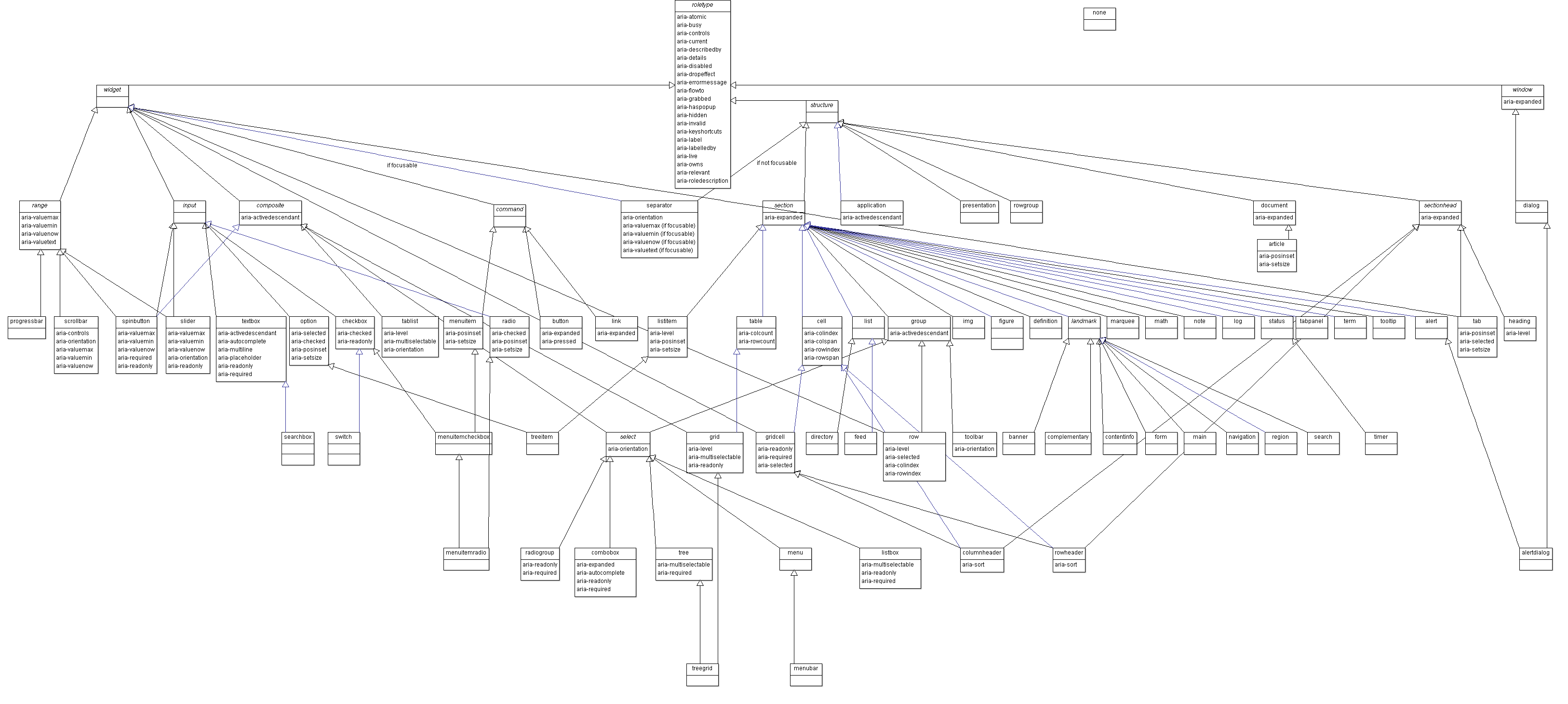
Also see the SVG Version of the WAI-ARIA Taxonomy
A UML-XMLversion and an RDF version are also available to import into systems that support these formats.